
I thought I would share some of my thoughts on the web design trends I’m seeing for the coming year. They focus purely on optimizing websites for mobile viewing. This is because it’s a huge shift that is already happening and is going to continue to happen even more in 2013.
Mobile first
 An estimated 1.2 billion smart devices will be purchased in 2013 (source). This is huge, and because of this, we need to start thinking about mobile devices first and desktop second.
The goal is to create a website that first and foremost looks great on a mobile device. Notice I said ‘mobile device’, not iPhone or Galaxy SIII. Why? Because new and different mobile devices are hitting the market so rapidly that web designers need to focus most on creating websites that will look great on any mobile device regardless of the size rather than focusing on just the most popular device.
When we think about our next website project in terms of mobile first, it brings a lot of focus to our design. Mobile first will make us better designers as it stretches us to make the website communicate effectively on a small touch-based screen where the audience’ attention span is even shorter. Many times it will be even more likely that your audience is multi-tasking and only has a few seconds to look at your website. Prioritizing your design/content has never been more important. No longer can you get away with those extraneous bits of design or content that are niceties but not necessities.
In the last year, the number of Internet page views on mobile devices has doubled (source). This points to a shift from desktops to mobile devices that has been happening the last few years and it is going to continue ever-so feverishly in 2013. Web designers need to adapt (pun intended) to this and think… mobile first.
No longer can you get away with those extraneous bits of design or content that are niceties but not necessities.
Responsive design
 While thinking, ‘mobile first’ focused on the overall concept of designing for mobile first and foremost, responsive design is more focused on how your website looks anywhere from a super-wide desktop screen to the smallest phone screen. The act of a website changing layout as you change devices or screen widths is responsive design. Simply put, responsive design is when a website ‘responds’ to the width of the screen and device to give the audience an optimal viewing experience.
The phrase ‘responsive design’ was first coined by Ethan Marcotte in a 2010 article. This article is the antithesis of the current trend that focused on creating separate websites for different devices. Responsive design means that your website layout is percentage based in order flex with the various device and screen widths out there.
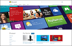
2012 saw a big explosion in responsive design. Top websites like Time, USA Today, Microsoft and Mashable all went responsive. With these top sites going responsive, 2013 will surely see many more small and large sites following suit.
How can your website layout flex from a wide desktop to a smartphone? The answer is: simpler design, fewer graphics, less ‘pixel-perfection’, and more CSS3 replacements.
Simpler web design (but not simplistic)
 As the number of websites going responsive rises, the design and layout of these sites will become significantly simpler than ever before (I said simpler, not more simplistic). Of course, this means that web designers need to adapt to these changes and think responsively: How can your website layout flex from a wide desktop to a smartphone? The answer is: simpler design, fewer graphics, less ‘pixel-perfection’, and more CSS3 replacements. This shift will reward great designers, because making a website simpler means it also needs to be effective. There’s a difference between simple and simplistic. A simple design is the result of many problems being solved and everything working just right. It’s just effortless. A simplistic design is the result of unresolved design problems and fear of the project at hand.